We Are One: Samba Digital and Bologna FC 1909
Bologna FC 1909 are one of Serie A’s most successful clubs. Across a history spanning more than one hundred years, they’ve won seven top flight titles, two domestic cups and a European title as well. And while the club may not have the name recognition of Juventus, Napoli, or the Milan clubs, it is a team which is fiercely proud of not only its own history, but also of the rich traditions and current culture of its home, Bologna.
Nestled in the heart of Emilia-Romagna, Bologna is home to the world’s oldest university, and a raft of architecturally significant buildings, some of which are nearly one thousand years old. From the Due Torri to the Fountain of Neptune, to the city’s many famous arched porticoes, Bologna is a city humming with history and tradition around every corner.
But it’s also a city that is alive with the present as well. Hip-hop culture, a large student population, lively open-air markets and a vibrant graffiti scene all help give the city a pulsating energy. It was all of this in mind that the club turned to Força, Samba Digital’s creative studio to help create a new visual identity for the 2023/24 Serie A season.
Merging new and old
Honoring both the character of the city itself as well as its inhabitants, we worked with Bologna to create a bold new graphic scheme that is unique as the club itself.
The overriding philosophy was one that unites both the strong, warm traditional colors of the club, along with the city’s iconic medieval architecture, but infuses it with a vibrancy that reflects its dual nature — being at once both ancient and modern.
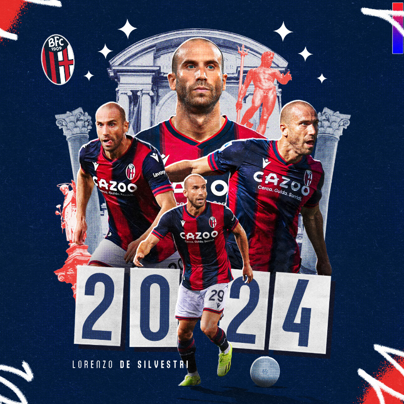
Prolungamento del contratto per @l_desilvestri 🔴🤝🔵#ForzaBFC #WeAreOne
— Bologna Fc 1909 (@Bolognafc1909) July 11, 2023
The elegance and sense of minimalism at play is at once modern and ancient — both traits are at once seen in the vast expanses of the city’s piazzas, but also in the sleek modernity of its newest architecture. This is also apparent in the use of a new, custom font (seen above in the player name). Bolo (a shortening of the city’s name) is clean, direct and simple, while also honoring the city’s arched porticoes.
In the identity as a whole, Bolo is combined with Subway Paris, a font reminiscent of graffiti, to lend an energy to the graphic identity. This energy is also built upon by using custom elements designed by Força that echo graffiti “tags” or quickly-drawn strokes. Placed at the corners of graphics, they lend even simple things like contract announcements or transfer graphics an energy in keeping with the philosophy of the project as a whole.
Modern history
The aesthetic is furthered also by the use of photography within the graphic scheme. Throughout the graphics being used, photographs of the city’s landmarks are used, but with a monochrome/halftone effect that evokes having been printed in an old newspaper. The effect is at once modern and calls to mind the history of the club itself over the course of the twentieth century.
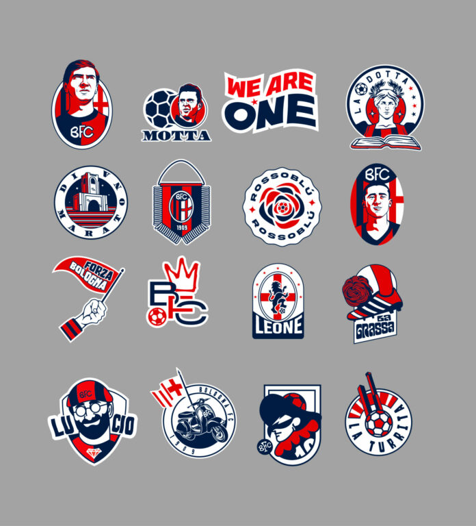
Finally, Força has also produced a number of stickers that tell the history of the club and the city. Stickers plastered to walls are a part of the contemporary urban environment and like the halftones, they also evoke a range of styles, hearkening back to the 1950s, ‘60s, or ‘70s. These can be added to graphics as well to lend a sense of urban verve.
In sum, Samba Digital and Força have created an identity for the club that succeeds in achieving every aim of the project. The history of both the city and the club have been honoured, but there’s also a clean and contemporary look that befits looking towards the future in terms of both the club’s ambitions on the pitch and its cultural presence.
Other News

The Running Boom Is Social: How Digital Platforms and Gen Z Are Reshaping the Sport
Brazilian Fans Are Changing the Game — and Brands Are Paying Attention

Beyond the final whistle: How the Super Bowl is becoming a global platform for experiences, brand activation and NFL expansion
Brazil emerges as a key market for FIFA, international clubs and digital sports strategy

Samba digital launches Fansights