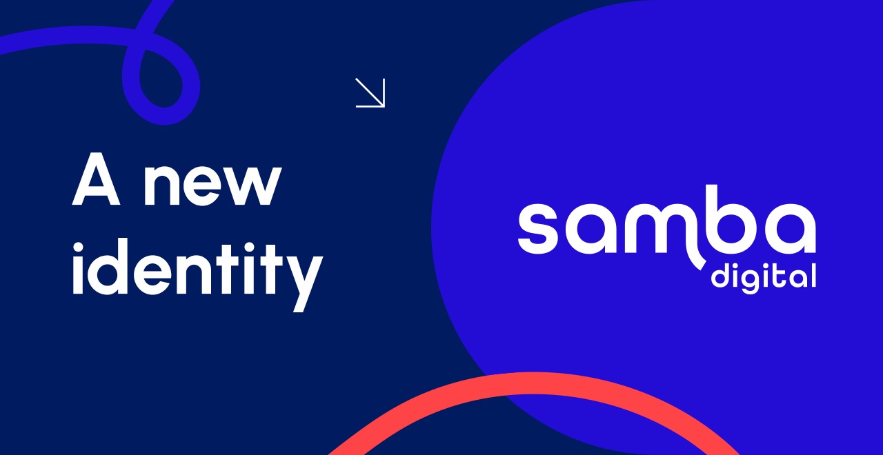
Embracing Innovation: The New Face of Samba Digital
At Samba Digital, we believe that evolution is integral to our journey. Over the years, our brand has been a symbol of our values, achievements, and the creative energy that drives us.
However, as the digital landscape continues to evolve, so must we.
Today, we are proud to unveil our new brand identity—one that not only reflects our roots but also embraces the future with a bold and dynamic vision.
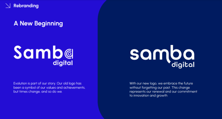
A New Beginning: Our Evolved Identity
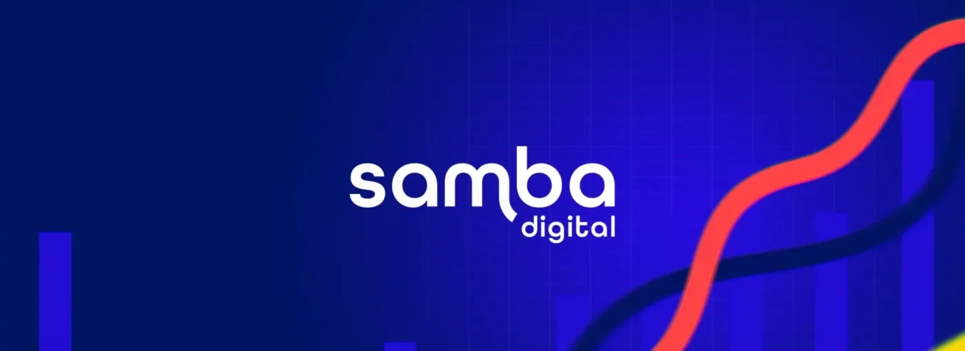
Our rebranding is more than just a change of logo—it’s a renewed commitment to innovation and growth. The new Samba Digital logo is a testament to our dedication to staying ahead of the curve, blending modernity with the essence of our multicultural identity. While honoring our past, we have refined our design to be more contemporary, aligning with the latest trends and the ever-changing digital environment.
The new logo features a refined typography that exudes elegance and clarity. The intensified colors symbolize confidence and dynamism, embodying our forward-thinking approach. This evolution represents our continuous adaptation to the needs of our clients and the digital world, ensuring that our brand remains relevant and impactful.
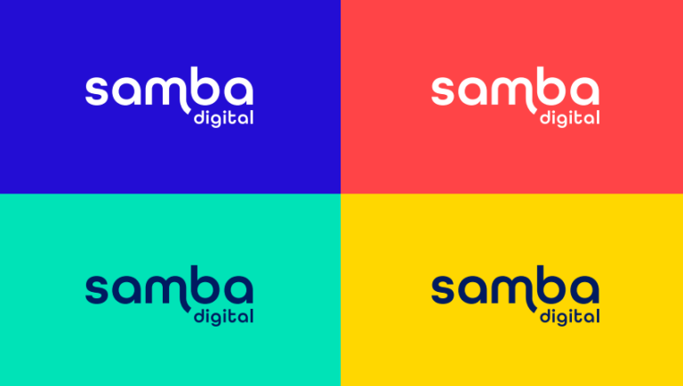
A Palette of Possibilities: Our Color Story
Central to our rebranding is an expanded color palette that reflects our energy, creativity, and professionalism. Each color has been carefully selected to convey specific aspects of our brand personality:
- Dark Blue represents trust and stability, serving as the foundation of our visual identity.
- Blue captures the essence of innovation and dynamism, aligning with our digital focus.
- Salmon adds a vibrant, human touch, highlighting our close connections with clients.
- Yellow evokes optimism and energy, symbolizing our positive outlook.
- Turquoise emphasizes freshness and adaptability, reflecting our ability to evolve.
Together, these colors create a cohesive and visually striking identity that stands out across all platforms, from social media to client presentations.
Typography: The Modern Edge
Our new typography, Urbanist, strikes a perfect balance between modernity and readability. It adds a contemporary touch to our brand while ensuring clarity across all communications. Whether in bold titles or easy-to-read body text, Urbanist enhances our message, making it both impactful and accessible.
Dynamic Visuals: A New Style for a New Era
The updated visual style of Samba Digital is characterized by colorful loops that symbolize our connections and flexibility. These loops represent the constant interaction with our clients and our ability to adapt to their needs in a rapidly changing digital landscape. The vibrant colors and fluid elements in our designs reflect our commitment to innovation and creativity, reinforcing our mission to grow and evolve alongside our clients.
The Power of Icons
Iconography plays a crucial role in our visual communication. Our rebranding includes two distinct styles of icons—line icons for larger applications and thumbnail icons for smaller uses. These icons are designed to be elegant and modern, ensuring that our visual elements are effective, attractive, and consistent across all contexts.
Ready for the Future
With our new brand identity, Samba Digital is poised to continue leading in the digital marketing space. Our refreshed look not only reflects who we are today but also where we’re headed—towards a future where creativity, innovation, and global connections remain at the heart of everything we do.
We are excited to embark on this new chapter, confident that our modernized branding will resonate with clients and partners around the world. Together, we’ll continue to create impactful, multicultural experiences that transcend borders and connect people through the power of digital.
Other News

The Running Boom Is Social: How Digital Platforms and Gen Z Are Reshaping the Sport
Brazilian Fans Are Changing the Game — and Brands Are Paying Attention

Beyond the final whistle: How the Super Bowl is becoming a global platform for experiences, brand activation and NFL expansion
Brazil emerges as a key market for FIFA, international clubs and digital sports strategy
Samba digital launches Fansights